/Daiichi Sankyo
Hirudoid Revitaliza
Context/ People associated the Hirudoid name with treatment. Revitaliza moved the brand into a category it had never occupied: body care for women, sold on comfort. There was nothing in the brand's existing visual language to inherit from, so the launch had to build a world of its own.
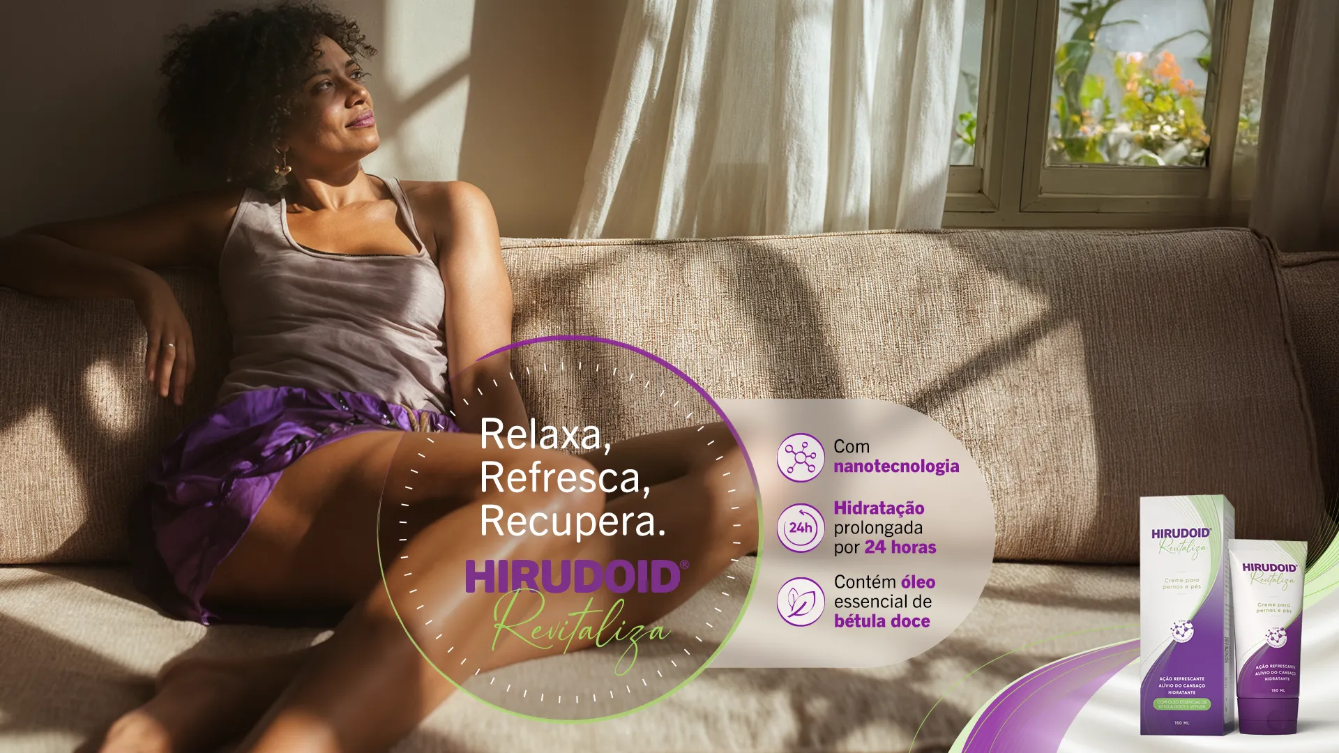
Idea/ Everything was designed around light: late afternoon through a curtain, plant shadows on a wall, a warm, tropical look that feels unmistakably Brazilian.
Every image was generated with AI from moodboards and real photographic lighting references. The hard part was realism: keeping skin texture and warmth believable in pictures with no camera behind them.
Results/ A complete campaign visual system, launched across social and point of sale. The key visual worked as a master the studio team could extend without losing the world it established.